
Wall-E
 Ouch!
Half-a-month since my last post! Well,
Ouch!
Half-a-month since my last post! Well, time
flies when you’re having fun time flies.
Things have simply been too hectic outside the
blogosphere lately but hopefully things will
improve from now on. One of the things I
did get round to was to catch Andrew
Stanton’s Wall-E
in the local theatre. Being a huge animation (and
Pixar) -fan I had been looking forward to this
film ever since it was announced. The panegyric
reviews it received upon its stateside release
further fueled my excitement. Thankfully the film
was well worth the wait.
Look - No Words!
I figure most of the people on the planet have an idea about the plot already so I want reiterate this in any detail. The film centers on the relationship between the two robots Wall-E and Eve. Perhaps more interestingly, it also includes some fairly serious social commentary.
 The
plot itself doesn’t necessarily redefine the
art-form. It is however well structured and
tells a concise story with one amazing
constraint: For the most part the film is told
without any dialogue what so ever. The two main
characters don’t speak at all (apart from a few
robotic renditions of their names). This is one
of my favorite aspects of the movie and a truly
brave decision of the filmmakers. It serves as a
reminder that storytelling doesn’t necessarily
require loads of words to work. (Unlike this
blog-post).
The
plot itself doesn’t necessarily redefine the
art-form. It is however well structured and
tells a concise story with one amazing
constraint: For the most part the film is told
without any dialogue what so ever. The two main
characters don’t speak at all (apart from a few
robotic renditions of their names). This is one
of my favorite aspects of the movie and a truly
brave decision of the filmmakers. It serves as a
reminder that storytelling doesn’t necessarily
require loads of words to work. (Unlike this
blog-post).
Taking its time
Another surprise was the film’s willingness to
slow down and «smell the  flowers». On several occasions Stanton slows the
action down and lets the audience drink from the
fountain of amazing visuals. Normally I would be
critical of an approach where the progress of the
story is sacrificed for the looks. Yet, in the
context of this film it works beautifully. Wall-E’s
character justifies it. He is in essence a child and
we get to share his awe of the wonders of space and
futuristic technology.
flowers». On several occasions Stanton slows the
action down and lets the audience drink from the
fountain of amazing visuals. Normally I would be
critical of an approach where the progress of the
story is sacrificed for the looks. Yet, in the
context of this film it works beautifully. Wall-E’s
character justifies it. He is in essence a child and
we get to share his awe of the wonders of space and
futuristic technology.
But the willingness to slow down isn’t used
exclusively to show off extra- terestrial
visuals. No, the earthbound opening is a
particularly interesting part in this respect.
Here we are presented with a dystopian
future-earth deprived of (almost) all life. If
you think this sounds dark for a family-film
you’re right. The tone of the film is one of
dark melancholy and while it betrays this
feeling occasionally the feel of the piece is
certainly not the un-compromised positivity you
might expect from Disney/Pixar. This might sound
like a turn-off to some of you but the film is
all the better for it.
terestrial
visuals. No, the earthbound opening is a
particularly interesting part in this respect.
Here we are presented with a dystopian
future-earth deprived of (almost) all life. If
you think this sounds dark for a family-film
you’re right. The tone of the film is one of
dark melancholy and while it betrays this
feeling occasionally the feel of the piece is
certainly not the un-compromised positivity you
might expect from Disney/Pixar. This might sound
like a turn-off to some of you but the film is
all the better for it.
Wall-E is simply put a masterpiece. It challenges the genre and treats the subject matter in a way that’s quite uncommon in contemporary Hollywood. In many ways it seems to borrow storytelling elements from asian animation (Hayao Miyazaki’s Totoro springs to mind).
If you have any interest in films, storytelling or animation go and see it.

Christmas Animation
Regular readers may have noticed that my bloging-frequency has taken a severe dip the last couple of weeks. One of the reasons for this is that I've started work on a Christmas Animation. (It's that time of year again*).
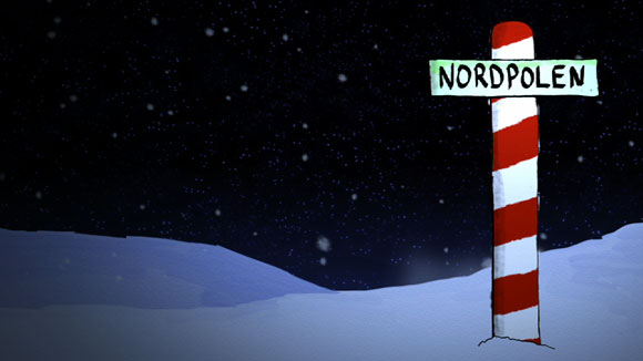
’’Nordpolen’’ is Norwegian for 'The North Pole'

The style I've chosen for this project is a simulated cut-out/handicraft look. This is more discernable when the images are in motion but hopefully these couple of images can help you get an idea of what I'm trying to achieve...
*It obviously isn't quite that time of year yet, but these things take time!
Not So Common Craft
 This
is what I love about the web. On one of my
many random search safaris through the maze
that makes up what we all know as the
internet, I came across the site
ICT Inspirations. This is in itself an
interesting blog (and I've bookmarked it), but
what was really great was how the blog revealed
to me the brilliance of The Common
Craft Show, something I had never heard
about before.
This
is what I love about the web. On one of my
many random search safaris through the maze
that makes up what we all know as the
internet, I came across the site
ICT Inspirations. This is in itself an
interesting blog (and I've bookmarked it), but
what was really great was how the blog revealed
to me the brilliance of The Common
Craft Show, something I had never heard
about before.
The Common Craft Show is made by Lee and Sachi LeFever and consists of small videos explaining complex ideas in a straightforward manner. They refer to themselves as interpreters which seems fairly accurate. Their simply brilliant (or brilliantly simple) style consists of well prepared cutouts, an equally well prepared voice over all put together by manipulating the cutouts physically in front of the camera and some really tight editing. The final product almost seems like a high-tech animated scrapbook and the effect is quite mesmerizing. Have a look at the below clip and see for yourself:
Common Craft's take on Google Docs
The first time I watched one of the clips I was hit by a hard spell of why-didn't-I-think-of-this-ulosis.
This is truly a brilliant example of visual storytelling if I ever saw one.
Ramblings #2 - Why good coffee is good and great coffee is crap
Coffe Time
As my former Superanomalies-clip was an outstanding success. (At least in the scope of this blog). I figured it was about time for another one.
Monkey business?
This one is all about coffee and is not
recommended for the squeamish coffee-drinker.
(Don't tell me you weren't warned). A higher
quality Quicktime-file is available
here. Any positive sensible feedback
is welcome.
"The Big Snit"
For some strange reason most of my posts so far have been either about poorly used visuals or about how the message might be better without visuals. Interesting as this may be, I also think I've been overly cautious. It is after all much easier to point out flaws than put your neck out and tell the world what you really like.

An example of Richard Condie's style as well as Sharon Condie's background-work
So, one out-sticking neck coming up. Okay, I'm not taking an enormous risk recommending an Academy Award Nominated animation. I do however find Richard Condie's "The Big Snit" from 1985 to be an absolute superb piece of visual storytelling. To some of you raving about this film is probably like raving about water being wet. I still find that it is nowhere near having the position it deserves among the general public though. This is not the Disney-, WB- or MGM-cartoon that's part of our common cultural fabric.
So why do I find this piece so brilliant? Well, as a piece of visual storytelling it is brilliant because the visuals are the main-source of the quirky humour it exudes. Normally a story about a couple experiencing domestic problems under the threat of nuclear holocaust is not your regular laugh-riot. Yet it clearly works here. Admittedly the humour is of the dark variation but thanks to the friendly style of the animation you're left with a positive feeling despite that ending. So, as I've already spent way too man words describing something that is better experienced I suggest you head over to the National Film Board of Canada and see for yourself.
LSD - take 2
Since my last post about the LSD project I haven't really made that much progression. Being more than a tad under the weather, finishing the first of my ramblings-films, bloging and my work at my dayjob has taken most of my time. When I in addition to all this played my first football- (soccer-) game for more than a decade it has obviously not been much time left for animation.

Some rough pencil sketches to guide me through the upcoming sequences
I have done a little work though. I've finished sketching out the opening tune for the titles and opening sequence and I'm fairly pleased with the jolly little accordion-waltz I've composed. In my own humble opinion it has the right "french" sound to it, which fits perfectly as the film starts in Paris. I have also done some rought pencil sketches for the next couple of sequences and got some new ideas for the title-sequence that seems to push their way to the front of my attention.Finally in case you were concerned, LSD (my film) does not have anything to do with drugs what-so-ever. It's actually an acronym and I promise to reveal the title the next time I mention the project.
Cheers!
Ramblings #1 - Superanomalies
Phew, it's hard work sorting out those a's and
o's in anamolies anamalies
anomalies!
I've been working for some time on the first installment of what I've chosen to call "Pointless Ramblings". No, that is not the new title of my blog. The idea behind this, and hopefully future ramblings, is to make a quick video about uh... something. I prepare a text relatively quickly and get a soundtrack in place based on the text. I then more or less improvise by making illustrations, animate text and put together a visual to accompany the video. In lack of a better term it could be called video-jazz.

Yes it does say superanomalies...
I don't nitpick on every detail, everything does not have to be great. OK is good enough. This is the only way I'll be able to get stuff like this out while still having some time left for more ambitious projects. Now, hopefully this should still mean that the "ramblings" are both watchable and mildly entertaining. I think #1 is, but I'm obviously biased. It has been said that _a picture is worth a thousand words_, so if my calculations are correct this film should be worth nearly 5 millions of them. Happy viewing!
A higher quality quicktime version is available here
LSD - part I
As we approach the end of the first month of 2008 I figured it's about time setting some personal goals for the new year. One of MY goals for the year MMVIII is to complete to short-movies, the first one an animation called "L.S.D.".
Now, I'm not a trained animator. I have however always been extremely fond of animation and the magic behind it and I've dabbled a little in these black arts since childhood with my father's super-8 camera. I also have several books on the subject and am not a stranger to running animations frame by frame just to get a clearer picture of the techniques used.
My current project really came about as I was expermenting with my new computer. I was curious to see how well it could cope with HD-video so I made a few rough sketches, a couple of frames of animation and made a composite. It all worked out very nicely and these humble beginings soon developed into a full-fledged idea for a chaotic, but hopefully entertaining, short-animation. I am also using the project as a learning tool to see where I can find short-cuts that doesn't ruin the experience as a whole. I must constantly remind myself not to spend too much time perfecting every piece and rather go for a raw but charming quality that I'm fairly pleased with so far.
If I were to describe the style/theme of the animation I think Tex Avery-meets-Terry Gilliam-meets-Scandinavian children animation is about right. Perhaps in the future this could simply be known as the T. Benjamin Larsen - style…
I'll return with more posts on the projects later, where I'll discuss techniques, tools etc. For now I'll leave you with the first public image from the film. See you later!

